This Interactive Heat Map Will Show You the Most Walkable Neighborhoods

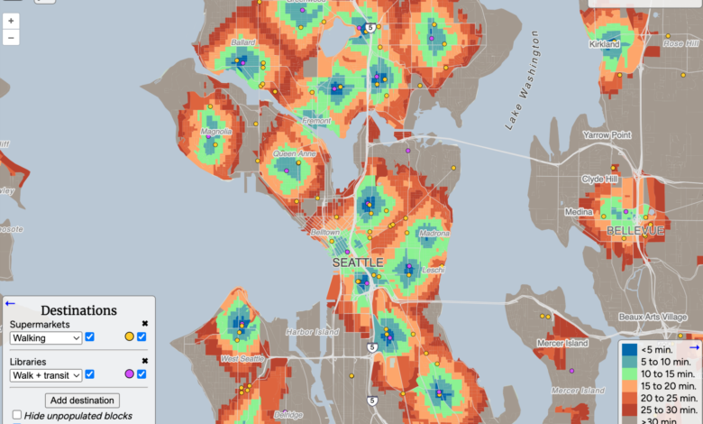
When choosing where to stay next time you travel—or what neighborhood to move to—you probably want to check out how long it’ll take you to reach the amenities you care about. Close is an interactive heat map that shows travel time to destinations such as supermarkets, schools, parks, libraries, and restaurants, via walking, biking, and/or public transit.

Credit: Emily Long
Close can be especially useful if you’re traveling to an unfamiliar city and want to book an Airbnb or other short-term rental in a neighborhood—and even more so if you won’t have access to a vehicle. You can check the listing’s information about walkability and nearby amenities against the Close map to determine what’s actually around.
How to use Close to find walkable neighborhoods
Open the Close map and type your city or county of interest into the search bar in the upper left corner. You can edit the types of amenities you want the map to show in the Destinations box in the lower left corner (click Add destination) and select whether you want to see the time based on walking, biking, or walking + transit. You can also toggle the specific amenity locations on or off—if they’re on, you can click the dots on the map to see the name and address of the supermarket, restaurant, school, etc.
As you add or remove destinations, the block-by-block heat map will change to show the travel time—ranging from fewer than five minutes to greater than 30 minutes—to reach the furthest of those amenities using the transportation methods selected. You can also select a specific block to see the breakdown of transit time.

Credit: Emily Long
Close also has a breakdown of how it classifies amenities, such as the difference between supermarkets and convenience stores. Note that the tool is currently in public beta, so expect the tool to evolve a bit over time.


