They not like us! Galaxy Watch Ultra and Buds 3 Pro is Apple stuff from Temu – but done right?
.
The “roast” didn’t go as planned. In fact, Samsung got roasted back by hundreds of X users who compared the anti-Apple tweets to a “cheap marketing campaign”.
And just when you thought it couldn’t get any more ironic, Samsung decides to drop the new Galaxy Watch Ultra and Galaxy Buds 3 and 3 Pro – without a doubt, the most Apple-inspired pair of Samsung devices we’ve ever seen in a while.
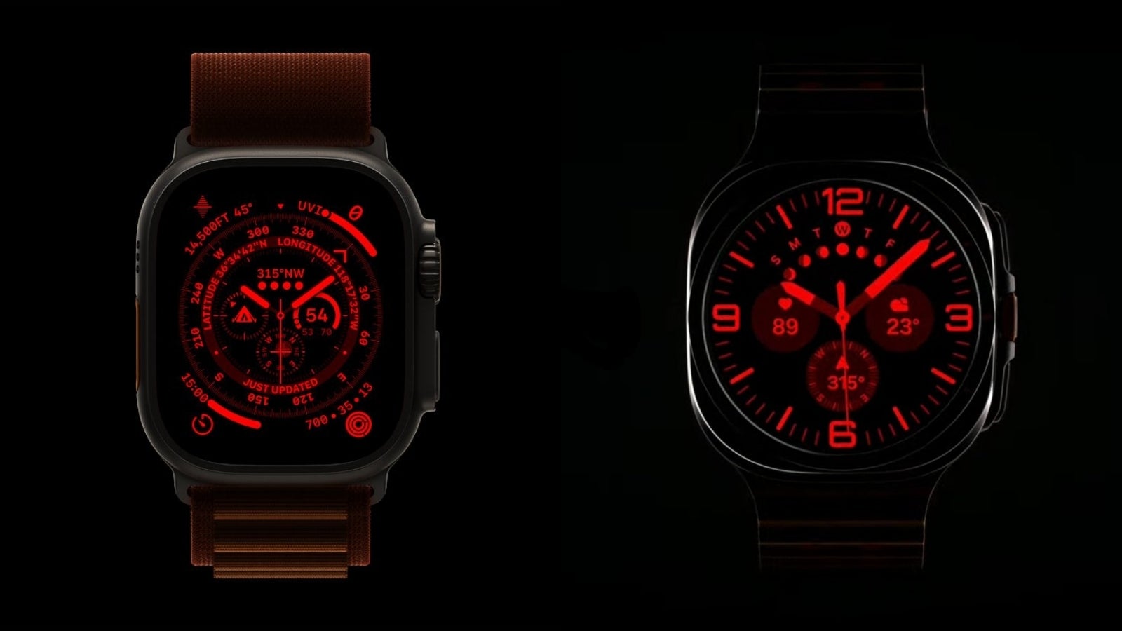

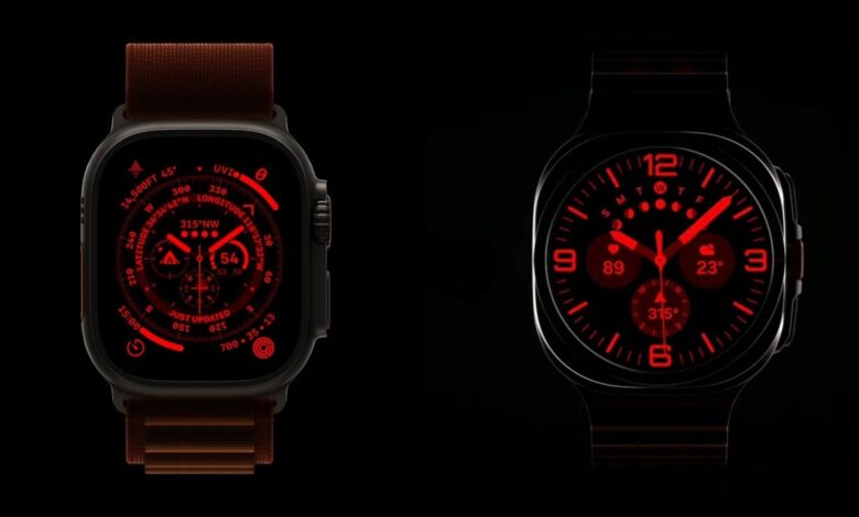
It goes without saying (but by looking at the two watches) that Samsung ripped off the basic “vibe” of the Apple Watch Ultra.
A titanium housing, a larger, square-ish sapphire crystal screen, an orange “Quick button”, and shockingly identical straps. Oh, and a super red Night mode, so the two Ultra watches look identical even in pitch dark.
And despite all of the “criminal” amount of similarities, I’m in the minority of people who actually like what Samsung has done here. And I don’t mean the “stealing” bit but the end result.
Frankly, I’m not a big “smartwatch” guy and I only use my Pixel Watch 2 because it came with my Pixel 8 Pro, but there are five things that make the Galaxy Watch Ultra more appealing to me compared to Apple’s Ultra watch.
5 things make the Galaxy Watch Ultra the better “Ultra” than the Apple Watch Ultra
Above all, I find the Galaxy Watch Ultra to be better-looking than the Apple Watch Ultra. Why? Well, Samsung’s Ultra watch pulls off a unique “square but round” look at the same time, and that’s something you don’t see often in the smartwatch world.
Sure, that’s not gonna be everybody’s cup of tea but it makes the Galaxy Watch Ultra easier to pair with different outfits – especially something more formal.
Number one, I commend Samsung’s decision to keep the circular watch face, which makes the Ultra look like a watch instead of a “wrist computer”. At least relative to the Apple Watch Ultra (and every other Apple Watch).
- It seems like many forget but the Galaxy Watch Ultra ($600) is $150 cheaper than the Apple Watch Ultra ($800), and that’s admirable considering the two seem to use identical materials
- Samsung’s Ultra watch is also said to have longer battery life than Apple Watch Ultra – at least in Power saving move (we’ll have to double check that)
- It also features two kinds of gestures that let you control the watch without touching it (instead of one on Apple Watch) – you can pinch your fingers (directly borrowed from Apple), or flick your wrist – that’s new!
- And for what it’s worth, it has “the most powerful chip on a smartwatch”, so… there’s that
No, Samsung didn’t steal the design of the Apple Watch Ultra for the Galaxy Watch Ultra – only the overall “vibe”
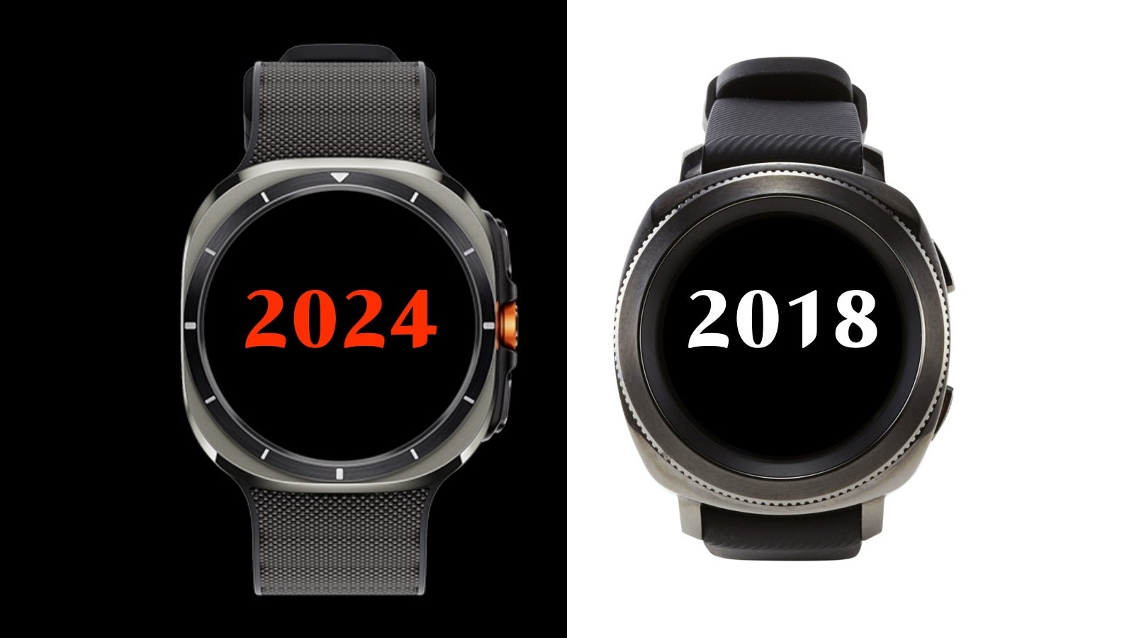

Galaxy Watch Ultra (left) vs Galaxy Gear Sport (right).”
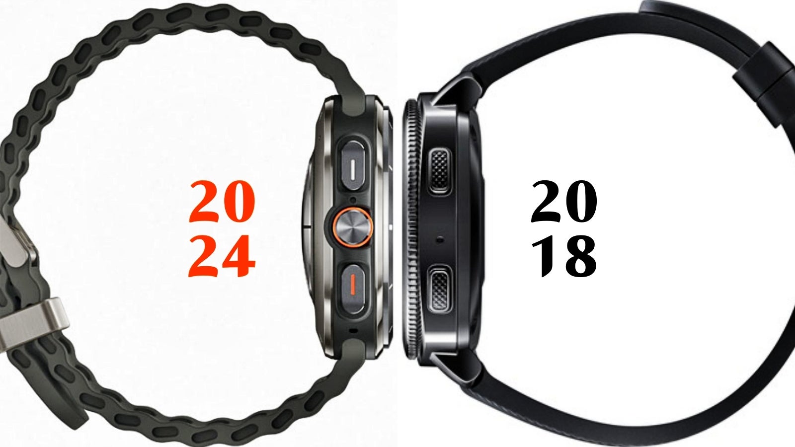

As you can see, the Gear Sport must’ve been the major inspiration behind the new Galaxy Watch Ultra. The front of the watches looks nearly identical, while even the button layout seems directly brought over from the Gear Sport.
Perhaps this isn’t all that surprising considering the Gear Sport was aimed at adventurous users who choose to stay active by doing more than walking (like me).
I can gladly bust the myth! The design of the Galaxy Watch Ultra’s actual “watch” part is absolutely NOT inspired by the Apple Watch Ultra. Unlike the straps. The orange-colored button. And the Night mode. And the marketing. And the name. But not the watch!!!
Replacing your iconic design with the competition’s: Apple-inspired Galaxy Buds 3 might be uglier, but they seem more practical than AirPods
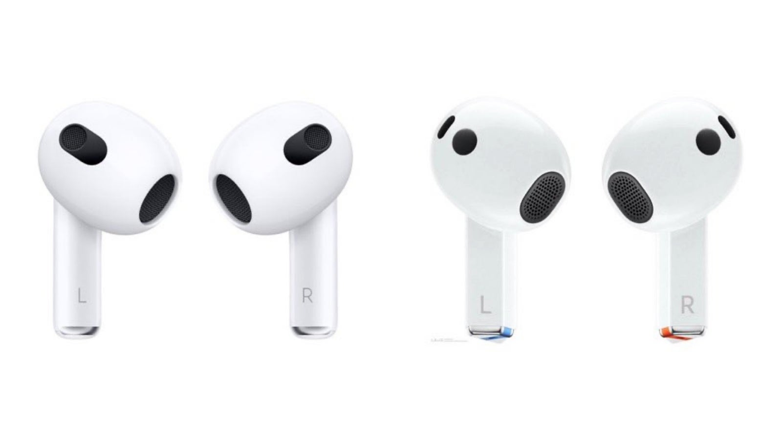

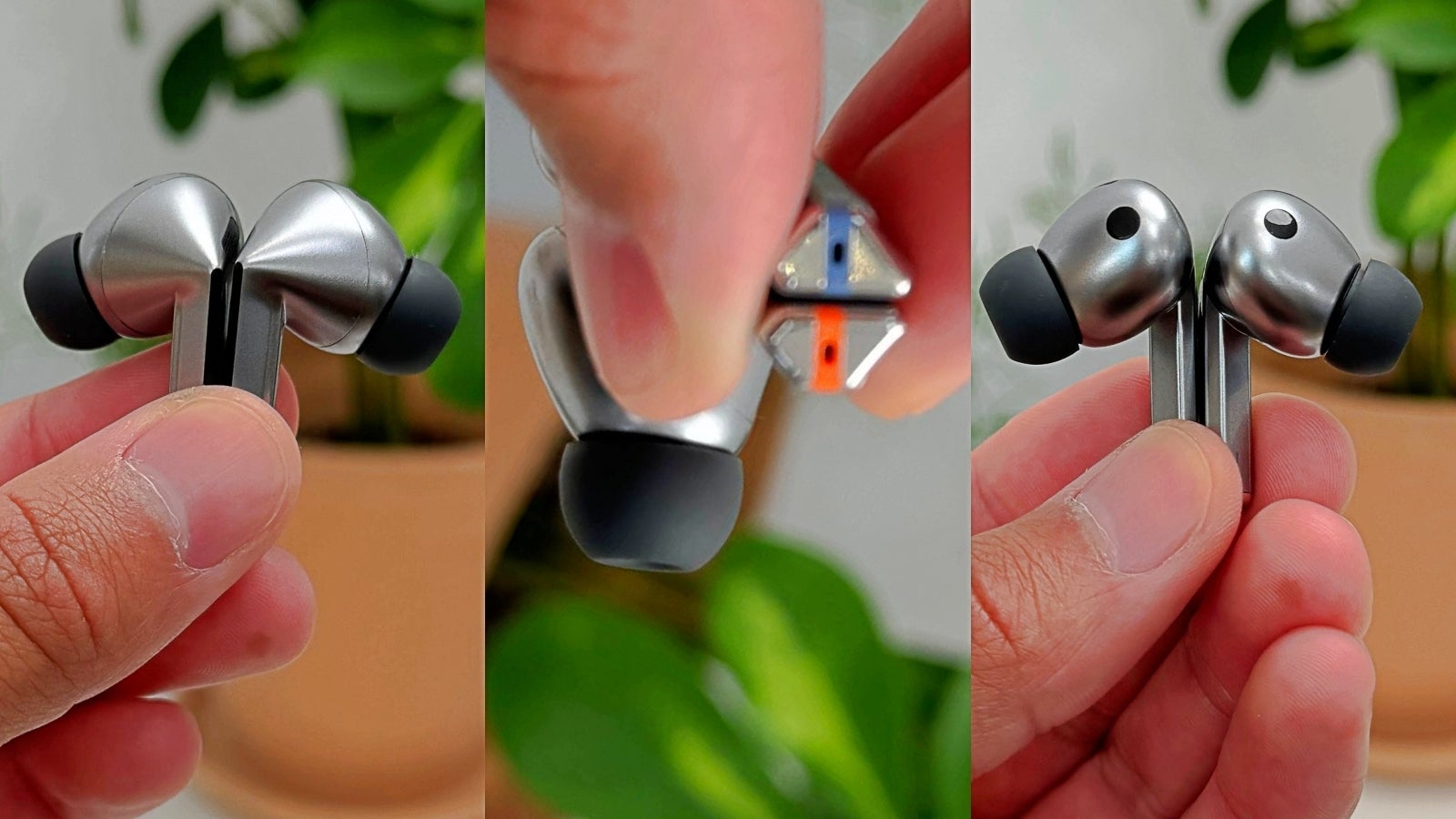


That being said, the stem Samsung went with has sharper corners and it sticks out in a very unique, bluetooth earpiece, type of way (which I don’t love).
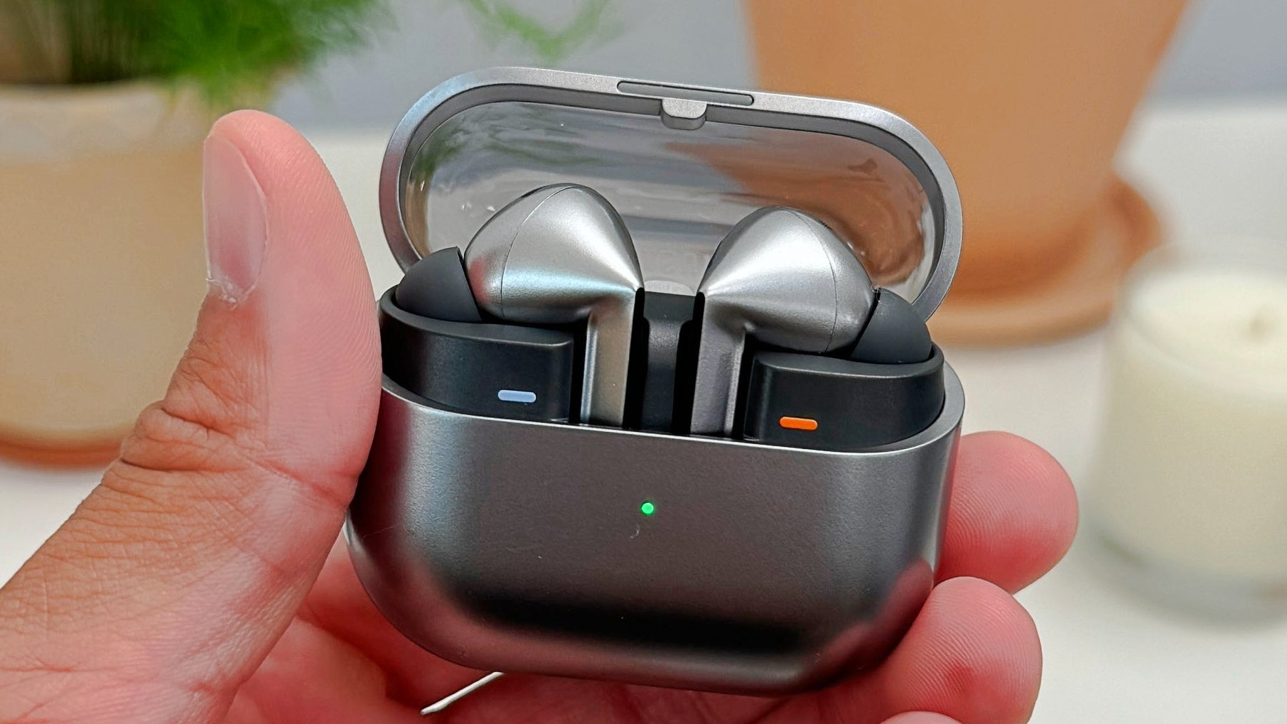
However, I think the case is what makes the Buds 3 and Buds 3 Pro better than AirPods.
I drop my AirPods rather often when I try to take them out of the case, because of how it’s designed, and it looks like Samsung tried to address this issue by cutting off the top half of the front bit of the case, which makes grabbing onto the earbuds easier.
The Nothing-inspired transparent case lid also looks cooler (unless you’re into a cleaner aesthetic), and the Buds 3 Pro have actual LED strips, which look gimmicky and cheap (to me), but should make it easier to see the earbuds in the dark – especially if you lose/misplace them.
We get it, Samsung – you can make a good Apple knock-off… But that’s not what leaders do


There’s this YouTube cooking show I watch from time to time, where host Joshua Weissman has a segment called “But better”.
The concept of the videos is that he takes a popular (often fast food) dish and makes it better… at home. And that’s more or less how I see Samsung’s new wearables compared to their Apple counterparts.
Of course, design is subjective, so you don’t have to agree with me on this one, but in the case of the Apple Watch Ultra vs Galaxy Watch Ultra, I do indeed find Samsung’s ticker to look more versatile, which is crucial for a wearable device.
On the other hand, I prefer the cleaner aesthetic of the AirPods Pro over the flashy looks of the Galaxy Buds 3 Pro. However, Samsung’s done a better job with the case, which seems more practical/cooler.
The point is that it is possible to get inspired by the competition and manage to make a product that looks just as good, or even better. However, that’s usually something we say about a smaller, less popular company – not Samsung.
It’s a cheap move, and a very ironic one considering the South Korean company won’t stop poking fun at Apple for being “slow”…
Perhaps Samsung wants Apple to pick up the pace so the South Korean company can get more… inspired?
Source link


